The circular gauge chart has gained popularity for use in exercise and activity charts, but has found use throughout modern dashboards for all types of data. .netCHARTING supports multiple nested circular gauges on one chart in addition to a single gauge per chart or even multiple gauges side by side.
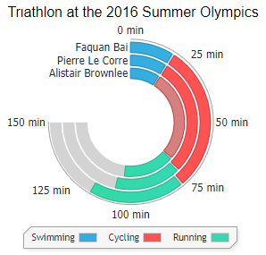
This circular gauge chart demonstrates multiple stacked values and provides at a glance comparisons with a modern label implementation.
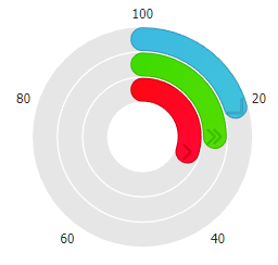
This gauge chart demonstrates three nested values including empty circles for the unfilled area. Each ring has a custom icon and colour that fills as the chart values increase. Circular gauges are idea at communicating values in excess of 100% unlike traditional gauges or bars as they can loop over 100%. In order to visualize this change, the hue of the ring changes when over 100% and a drop shadow makes it clear that the value exceeded its range.

Here a single circular gauge uses a custom icon in the middle cutout that is also customized with a matching color. The hue shift is visible in the ring as it approaches 100%.
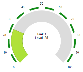
In addition to activity charts, finance, energy and more, circular gauges are also useful for industry applications such as tank level charts. Here, axis breaks are used to better visualize the different tank level changes at a glance.
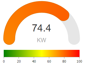
Energy usage is charted in realtime using this circular gauge configured as half of a full ring or circular arc. The ring colour changes with the instantanous energy usage value to provide another visual cue and realtime textual data is included inside the gauge semi-circle. A dynamic palette shows possible colour values in the range for energy usage at any given time.