Introduction
A number of different gauge types are available within the gauge series type and can be specified by the Series.GaugeType property. Each series on a gauge chart can use a different gauge type setting.
[C#]

mySeries.GaugeType = GaugeType.Circular;
[Visual Basic]

mySeries.GaugeType = GaugeType.Circular
 |
Gauges can also be used with ChartType.Multiple and ChartType.MultipleGrouped when Series.Type = SeriesTypeMultiple.Gauges. |
Automatic Padding Feature
Generally many of these gauge types are used by themselves without a legend or other features. When the chart detects that the legend is not visible and the chart area is not drawn (by using ChartArea.ClearColors()), it will automatically get rid of additional padding around the gauge.
Manual Sizing and Positioning (New in v4.4)
A static size can be applied to any gauge series by using the Series.Box.Position property and specifying a Size object.
[C#]

mySeries.Box.Position = new Size(100,100);
[Visual Basic]

mySeries.Box.Position = new Size(100,100)
This feature also allows absolute positioning of each gauge when a Rectangle object is used instead.
[C#]

mySeries.Box.Position = new Rectangle(20,20,100,100);
[Visual Basic]

mySeries.Box.Position = new Rectangle(20,20,100,100)
 |
Circular gauges height must be the same as their width, therefore, only the specified Width is used with this feature. |
QuickStart Illustration
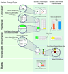
The following illustration shows which properties control certain aspects of gauge types.
Gauge type options (Series.GaugeType)
Circular
The circular type is the default gauge type used.
Custom Image Needles
This type also supports using custom images as needles along with the DynamicColor feature of ElementMarkers. For more information on using custom needles, see the Element Markers.
Supported Features
- All axis scale types except for stacked scales.
- Supports axis markers.
- Multiple needle types
- Multiple needles within a gauge
- An icon within the gauge using YAxis.LabelMarker
- Glass Shading when Chart.ClipGauges = false and Chart.Use3D = true
Related Properties
- YAxis.Line (border line properties)
- YAxis.LabelMarker
- YAxis.OrientationAngle
- YAxis.RangeAngle
- YAxis.SweepAngle
- Series.Background (background color)
- Series.NeedleType
- Series.GaugeBorderShape
- Series.Box
- Chart.ClipGauges
- Chart.Use3D (effect when not clipped)
Bars
This gauge type can be useful displaying element values when an axis scale is not necessary.
Supported Features
- All axis scale types.
- Axis minimum/maximum settings
- All bar ShadingEffectModes.
- The XAxis Tick and Element's Label is used along side of the bars.
- The tick and element labels can be aligned to right, left, or center (element label only).
- Segmented Bar type when using Series.Type = SeriesType.BarSegmented
Related Properties
- Series.Background (background color)
- Series.GaugeBorderShape
- Series.Box
- Series.Type ( Bar or BarSegmented )
- Chart.ShadingEffectMode
Digital Readout
This gauge type can be used to display element values using a digital readout style.
Supported Features
- Digital readout font styles include Normal, Italic, Bold, and Bold Italic.
- The XAxis Tick Label is used along side of the readout.
- The axis tick and digital labels can be aligned to right or left.
Related Properties
- Series.Background (background color)
- Series.GaugeBorderShape
- Series.Box
- Series.Type ( Bar or BarSegmented )
- Element.SmartLabel.Font (Used to specify digital readout font style)
IndicatorLights
These indicator LEDs can be used to convey the status of an element. If the element's value is < 0, the element's LED is grayed out, if the value is above zero, the element's color is used.
SmartPalette
Using smartPalettes with this type, the gray/colored feature based on value is deactivated. The smart palette is used to determine the element's color instead.
The size of the LEDs on a particular chart can be specified with Chart.DefaultElement.Marker.Size, however, by default the LED sizes are determined dynamically. The actual element markers however can be drawn separately on top of the LEDs when Element.ForceMarker is true as shown in sample Gallery/h018.aspx
Supported Features
- All bubble ShadingEffectModes.
- The XAxis Tick and Element's Label is used along side of the LEDs.
- The tick and element labels can be aligned to right, left, or center (element label only).
- Markers can be drawn on top of the LEDs.
Related Properties
- Series.Background (background color)
- Series.GaugeBorderShape
- Series.Box
- Chart.ShadingEffectMode
- Chart.DefaultElement.Marker.Size
Horizontal & Vertical (Includes Thermometers)
The horizontal and vertical gauge types are linear bar gauges with the YAxis but no XAxis. The y axis applies to both horizontal and vertical the same way, when the type is horizontal, the YAxis is the horizontal one and with vertical, the YAxis is vertical.
Normal & Thermometer styles
To use the thermometer variation use the following setting:
[C#]

Chart.DefaultSeries.GaugeLinearStyle = GaugeLinearStyle.Thermometer;
[Visual Basic]

Chart.DefaultSeries.GaugeLinearStyle = GaugeLinearStyle.Thermometer
Bar Widths
By default the element widths snap to the size of the gauge's mini chart area, however, the XAxis.SpacingPercentage or XAxis.StaticColumnWidth settings will be used if specified.
Supported Features
- All axis scale types except for stacked scales.
- Multiple elements for bars and thermometers.
- Supports axis markers.
- Thermometer GaugeLinearStyle
- All bar shading effect modes for thermometers and bars.
- Supports Columns BarSegmented and Marker Series Types.
*Markers not available on thermometers. - SubValues
- Virtually all axis features of combo types are available.
- ImageBarTemplate support
Related Properties
- YAxis.Line (border line properties)
- YAxis members
- Series.Background (background color)
- Series.GaugeBorderShape
- Series.GaugeLinearStyle
- Series.Box
- Chart.XAxis.SpacingPercentage
- Chart.XAxis.StaticColumnWidth
- Chart.ShadingEffectMode
 |
Please see the Features > Gauge Type Tweaks section in samples for examples using gauge types. |


